Modern Element Trends in Magazine-Styled Webdeign of 2010

 Many web designers today are moving away from the traditional layout of a website. One of the layouts that are in trend today is magazine or news style of website. Magazine-styled website offer good usability, clean typography, and professional interface. Adding on to that is that even if you put many elements on a page, it will still look organized and not overcrowded. Usually, magazine style is used for online periodicals, lifestyle, and fashion websites.
Common Features of a Magazine-styled Website
Generally, these are the things you will see on a magazine-styled website.
1. Horizontal Navigation
It is common on any website to have a horizontal navigation, and that also goes with magazine-styled websites.
Horizontal navigation limits the space used because navigations always go from left to right. Also, you don’t have to scroll down to find the last navigation. Adding on to that is the easy to understand drop down sub menus.
As I am searching for magazine-styled websites, I have seen one website with vertical navigation.
The good thing about vertical navigation is you can group sub categories without using a drop down menu. But, seldom web designers use vertical navigations for users quickly notice the menus if they are put at the top, horizontally.
2. Drop Down for Sub Menus
Since there are various menus and sub menus for a magazine-styled website, drop down menus make it easier for visitors to find what they are looking for.
Take a look at the website Slate. Instead of using sub menus under the main menus, you will see the articles listed on that menu.
3. Categories
Because magazine-styled websites have lots of contents, most of the articles are categorized to let visitors find what they are searching for based on categories.
4. Search Bar
The same goes with Search Bar. Websites with magazine style of layout have many contents to put on, and that is why most of them have search bars. In this case, visitors can find the specific topics they are searching for easily and quickly.
5. Popular News/Stories Section
Articles listed on the Popular News or Stories section are the most read by visitors of a website. Listing these kinds of articles is a great way to inform your readers on which are the most clicked.
6. Latest News/Headlines
With many contents posted on websites, putting Latest News or Headlines section on a website is recommended. This informs visitors and users on what the newly published articles on the website are.
Look at this website, not only that headlines are listed, there is also a mark saying “Most Read” for the most clicked link in an article. This informs users which are the popular ones.
7. Images and Videos
Putting images and videos on your website is one way to capture the attention of your visitors. Images are one way of letting your visitors understand the message you convey. And based on research, people like to view images rather than reading pure texts only.
Videos have become more common for online websites today, especially with online news sites. If viewers missed something on TV, they can watch it online. And instead of reading what seems boring to some viewers, they can just watch a video relating to that article.
8. Light-colored Background
Magazine-styled websites have light-colored background and the commonly used color is white. Light-colored background is better for it makes the content readable.
9. Columned or Grid-based Contents
Like what we see on magazines, contents are grouped into columns or sometimes into grids. The same goes with magazine-styled websites, grids are effective to use for they keep the contents well-spaced and noticeable.
10. Clean Typography
For magazine-styled websites, it is important to consider the typography for it puts a lot of content on a page.
Take a look at The New Yorker website. Even though it has a lot of content on its homepage, it still looks organized because of the neat-looking typography, grid-based contents and also the white background it has.
In this article, I collected different kinds of well-designed websites with magazine style. I hope you will be inspired like how I was with this compilation.
1. Azure
2. InStyle
3. InStyle UK
4. Giant Magazine
5. People
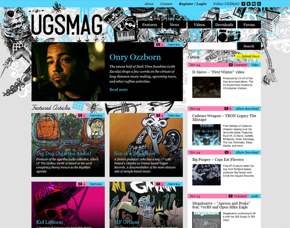
6. UGS Magazine
7. Clutch Magazine
8. Typographica
9. Vogue
10. Dazed Digital
11. WWD
12. Justine Timberlake Website
13. GQ Magazine
14. Macalicious
15. Vanity Fair
16. Spin
17. WMagazine
18. Rua De Baixo
19. Black Book
20. NFL UK
21. Wired News
22. Zaum & Brown Website
23. Details
24. More
25. UX Magazine
26. New York Magazine
27. One Nation Magazine
28. Frieze
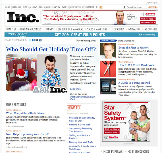
29. INC
30. San Francisco
31. Creative & Live
32. IndiePit
33. Portfolio
34. BMI Voyager
35. TIME
36. The Christian Science Monitor
37. CNN
38. BBC
39. Economist
40. FILE Magazine
Before I finish, let me give you some advantages of a website with magazine style of layout.
Advantages of Magazine-styled Layout
1. It gives a professional look of a website.
A light-colored background with a clean typography where contents are put into columns or grids are some of the ingredients to make a website look professional.
2. Good choice of style for websites with a lot of contents to put on.
With a magazine-styled website, you can put several contents on a page without cluttering them.
3. It is easier and quicker to search for topics.
It is easier and quicker for users to search a certain topic for they are categorized. For instance, most read articles are found on the Most Popular section. While, newly posted articles are to be found on the Latest News or Headlines section.
To be fair, let me also give you the disadvantages of a magazine-styled layout.
Disadvantages of Magazine-styled Layout
1. Confusion on what to click.
Viewers might be confused on what to click because many things are posted on a page.
2. Contents may look cluttered or disorganized.
If magazine-styled website is not well designed, contents may look cluttered or disorganized. To help you with this, always stick on a light-colored background, columned or grid-based contents and clean looking typography.
3. More maintenance and updates.
A magazine-styled website entails more maintenance and updates on the part of the web administrator. But it still depends on how often the website is updated. The more articles published, the more work for the administrator.
Share your Thoughts
What about you? What do you think about magazine-styled websites? Let us know your thoughts on the Comment section.
- Login om te reageren


