Data-Driven Web Design: How to Take Advantage of It

 Web design should be all about creativity, right? Free flow of ideas, designing what you want etc…While all of that is important, there are various ways to use objective data to get the most out of your design efforts. In this article, I’ll assume you’re a freelancer and working on someones else project. What steps can you take to ensure your web-design is data-driven?
Ask for Web Analytics Information
Why would you do that? To learn more about the visitors. For example, here are the browser statistics for July 2010. Does the same stats apply for the new website you’re designing? Even w3Schools says:

To prove, here are some statistics of a website I have:

These percentages have nothing to do with the w3c data. The reasons are: a) The site was tech-related so most people weren’t using Internet Explorer at all b) The traffic came mainly from social media sites like StumbleUpon and Digg
Each site is unique in terms of its visitors. The best way to find this is to ask for the data. That way you’ll know what to REALLY focus on. For example, if you see a considerable amount of traffic coming from mobile then you want to make sure there’s a mobile-compatible version. There are many ways this data can potentially help you, but don’t obsess too much about it.
Another user analytics feature is site overlay which will tell you where people clicked on the old website.
The above information applies to sites who are not new and need a redesign. If you’re designing a totally new site, then asking for analytics information for a related site that person owns on that topic might be helpful.
If you don’t have access to the analytics information, that’s okay. This is only a tip you can try out, not really required. The point here was to eventually find some exceptions to the general statistics (like on my site where most of the people use Firefox). You can also learn in the analytics report on what screen resolutions people have, what operating systems they use etc.
If the Site has a ‘Goal’, Design Different Versions for A/B Split Test
By a ‘goal’, I mean the visitor taking some action like registering, buying a product and so on.
People may require you to design different versions of the same page in order for them to test which version works best for converting. So how do you go about designing a different version of a same page?
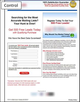
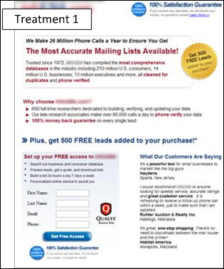
Conversion rate experts recommend you go and first make a radically different design/s of a same page. To illustrate, here’s one example (the “control” is the original page, while the “treatment” is the radical re-design):
source: MarketingExperiments
You see what they did? First of all, they changed all of the text to make sure they emphasize the most important features of the product. But we want to focus on the design now, not on the text.
They also changed the whole design of the page. The buttons were changed, new images were added, they made place for important information etc. The result? The conversion on increased from 4% (the control) to 14% (the treatment). That is 200% increase! This is not the rule though, you shouldn’t expect 200% conversion improvement in every radical re-design you make, but you’ll eventually have big wins like this once in a while.
You’ll eventually need to learn something about conversion rate optimization because many companies are starting to get data-driven these days. So you might notice increasing requests for A/B split testing so you’ll need to start making different versions of a same page. Remember that starting with radical redesigns at the beginning helps a lot. Then you move to some minor changes, like testing various buttons, ‘100% satisfaction guarantees’ pictures etc.
Each website has a different goal (for some, it’s getting new users, for some, sales).
Learn more about conversion rate optimization:
- Conversion Rate Experts
- Marketing Experiments Webinars
- Which Test Won (shows you the potential power of A/B split testing)
Web Design Usability – Uh…
I think that usability applied to the extreme might result in killing creativity (which is what web designers hate). If you take a balanced view, however, you can use usability to greatly enhance your design.
Jakob Nielsen has a whole range of usability articles for web designers. Some of the interesting tips he suggests are:
- Test your competitor’s designs to get an idea of what alternatives they use for their own designs (they probably use some similar alternatives to yours). By ‘testing’, usability experts mean taking test participants and give them a specific job to complete, like registering or getting to the shopping cart.
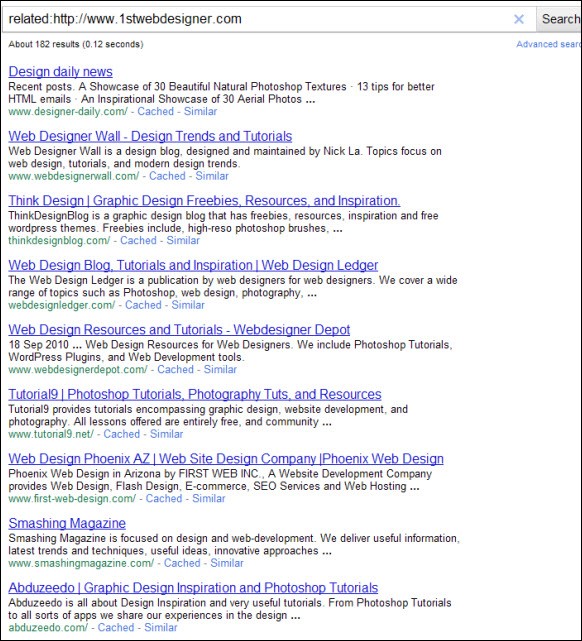
Off topic: A good tip (if you aren’t already using it) is to take a look at related websites of your client and see what they do. Your client will probably want a site that is somewhat similar to his competitor sites anyway, so it doesn’t hurt to try this tip. How do you find related websites ? Just type:
related:http://websitename.com in Google. For example, here are some related websites to 1stWebDesigner:
Pretty accurate, if you ask me. 1stWebDesigner has a lot of showcase-type posts so Google is also trying to find blogs that show showcases as well.
Some very important mistakes to avoid in web usability (mentioned here but I’ll emphasize what they mean):
- Bad site search (some people don’t want to browse but prefer to search the site)
- Using PDF files for online reading (occasionally used to show portfolios and quotes), change that to using an online form or just make it into a web page
- Non-scannable text - people barely read 1/4 of a typical article so make sure the most important points are emphasized so it catches people attention
- Not changing color of visiting links – contributes to bad user experience
- Don’t make it look like an advertisement if it’s information – if you have some important information, don’t make it like a banner because less people will read it (no surprise here, not many people like banners, to be honest)
- Violating user expectations by breaking web design conventions – we all have some idea on how a typical website looks like (name on top, navigation on top or left, text in the middle). Sure, you can probably get creative if it is a company’s website. But then, you don’t really help people find what they’re looking for which is more information about the company because they have to spend more time figuring out where things are and where to click.
Useful usability resources:
- CrazyEgg – shows you a heatmap of where your visitors click on the site
- KISSMetrics - can give you an idea of what people think about your website
- 4Q - gives you answers to these questions:
- What are the visitors trying to do?
- Are they completing what they’re trying to do?
- If not, why not?
- How satisfied are they?
While not perfect, 4Q can give you pretty good answers to those questions.
- Login om te reageren


