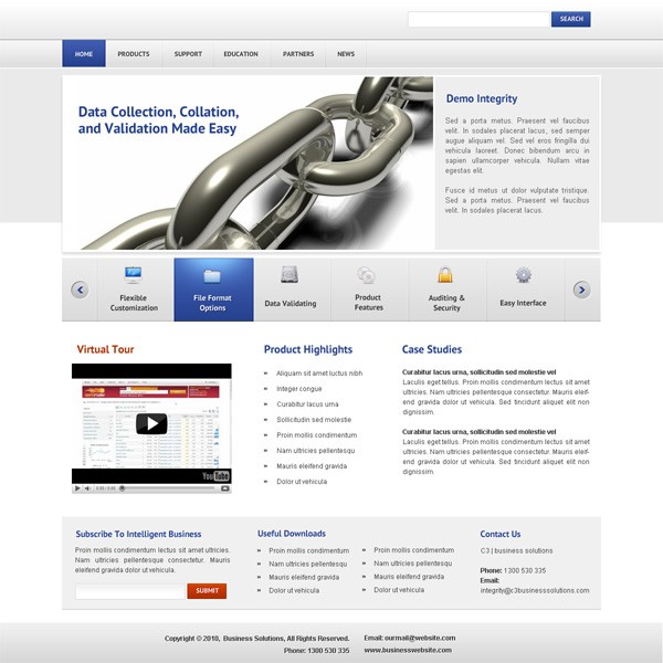
Corporate Business – Design a Modern & Stunning Web Layout

In this tutorial we’re going to create a clean and professional business layout in Photoshop. It has a great mix of colors and elements and is great for business owners and service providers. This tutorial, though long, is very detailed. Only worked with Photoshop a bit? Or maybe you’re just starting to design web layouts using Photoshop, no matter what your skill level if you carefully follow each of the steps at the end you’ll have something a finished layout similar to mine.
Preview of Final Result
Resources
- PT Sans Bold – FontSquirrel
- Free App Icons for Developers – WebAppers
Step 1
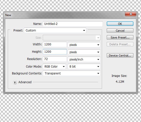
Open Photoshop and create a new document that is 1200 x 1200 pixels, 72 dpi, and RGB Color. Fill the layer with white. (Ctrl+Backspace or Delete)
Step 2
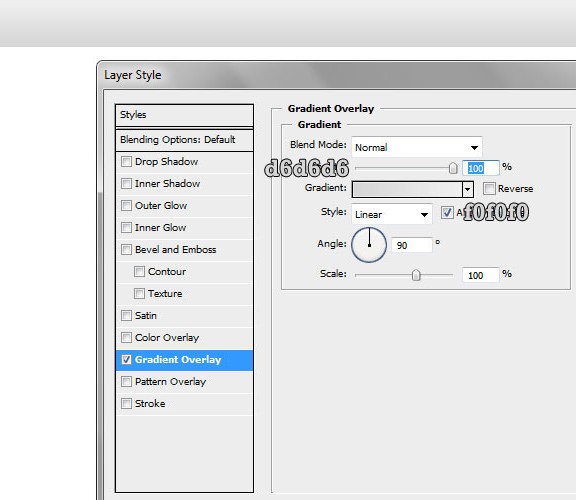
Now create a rectangle for the header and fill it with a white-grey color, then use the colors on the image for the “Gradient Overlay”. Our search and logo will eventually be part of the header.
Step 3
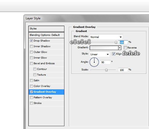
Create a new rectangle above the previous one, with attributes as shown below. The following drop shadow effect creates a look of a 1 pixel stroke which does increase the look of that simple bar. Note: this step creates a horizontal line.

Step 4
Now add the “Gradient Overlay” layer style with the hex codes indicated.
Step 5
Add a white 1 pixel stroke. The following stroke of 1 pixel will divide the grey shadow effect. It’ll eventually work as a divider.
Step 6
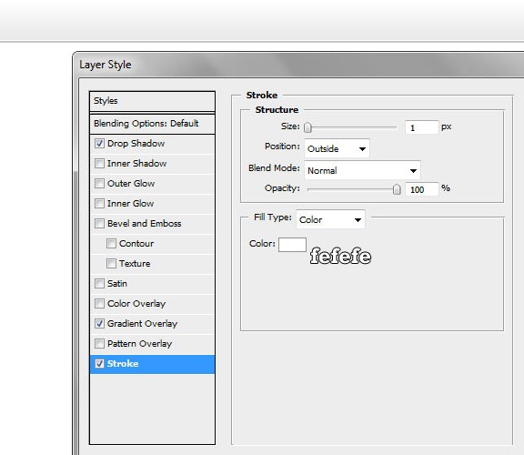
Make one more rectangle in the middle-right zone, and fill it with white and add a 1 px stroke as indicated – it will be our search box.
Step 7
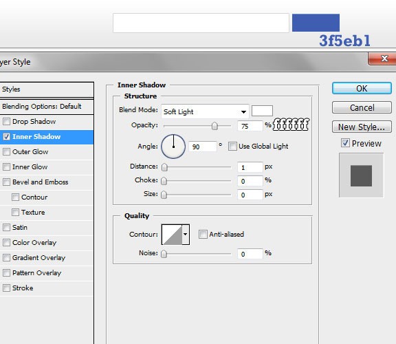
One more rectangle should be created and filled with blue. Set the inner shadow as indicated below, this will be our search button. This blue works great in combination with grey, white and light-grey. Blue will be the major contrasting color we use as we work through this template.
Step 8
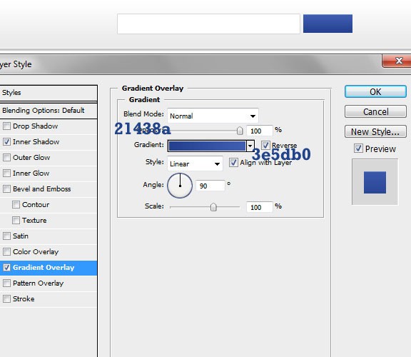
Add the Gradient Overlay details to the button with the details from image.
Step 9
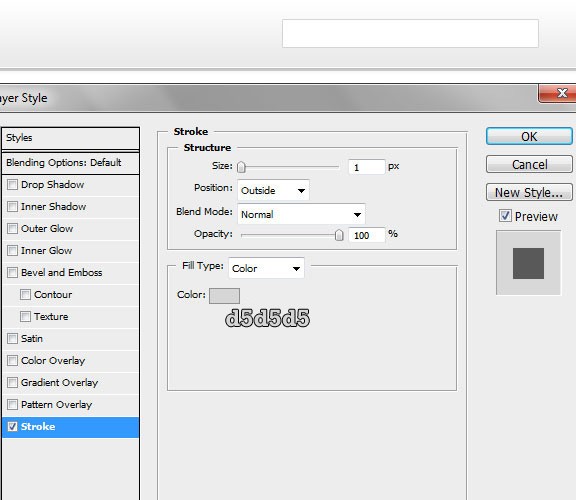
Add a 1 px stroke to the button with the color indicated. Take a look at the first and the final result of the button so you can see the difference all these details made.
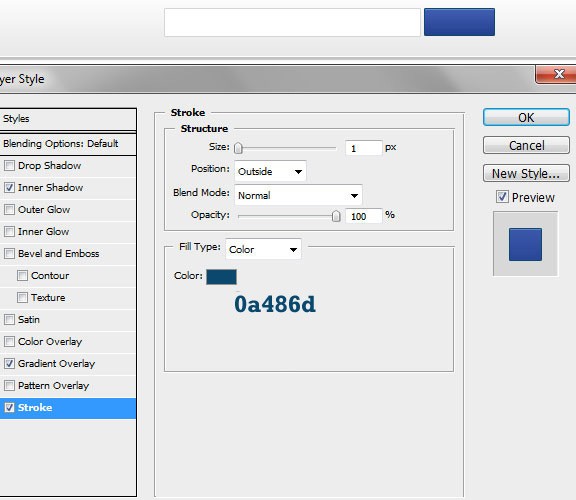
Step 10
Now add this drop shadow effect for the text placed in the search box, using PT Sans Bold. This will be the final step in creating your search button. You may want to try other fonts, but the PT Sans Bold is really good for this small button.
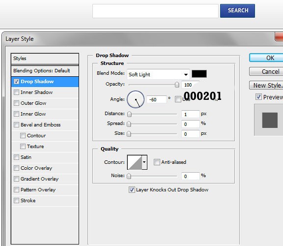
Step 11
Make another fill under the header section, this will be the navigation area. Here we will place the navigation links of our template.
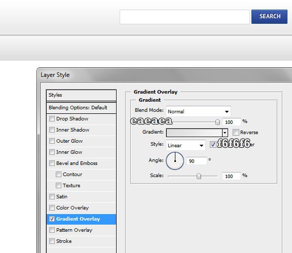
Step 12
Write your navigation links using a dark-grey color, then add a white “drop shadow” effect. The effect used for the navigation links is the same used for the search button.
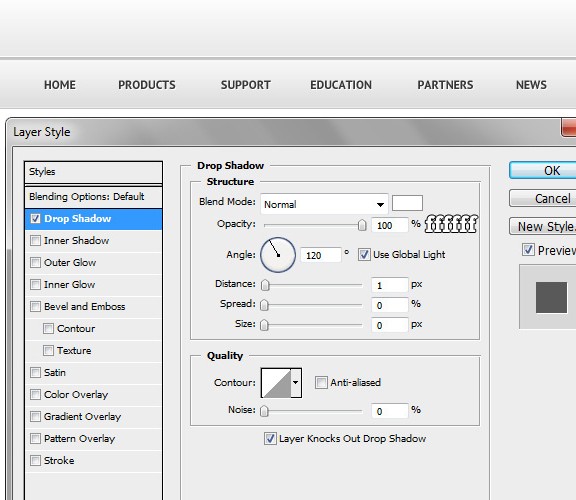
Step 13
With 1px vertical line, make divisions between each links. The lines should be black and will really increase the beauty of the navigation area.

Step 14
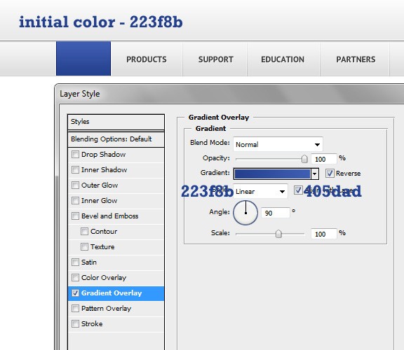
Over the home section, make a fill with the blue and then add a Gradient Overlay style as indicated.
Step 15
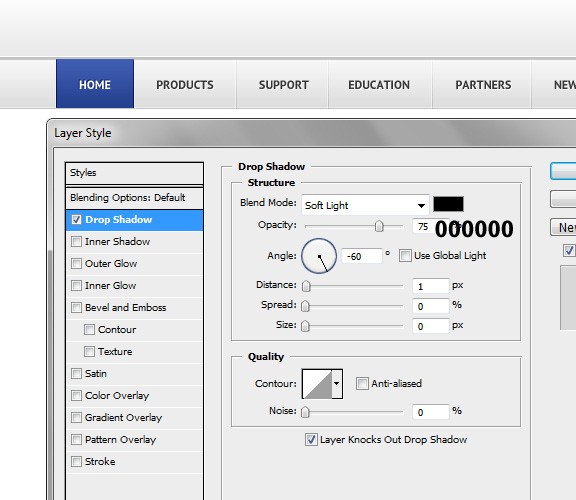
Copy the Home link, this time color it white and add a drop shadow effect.


Step 16
Create a big, grey zone under the navigation, it should be about 30% of the layout. This will be the background for the featured area.
Step 17
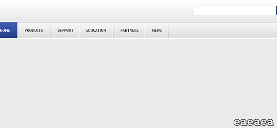
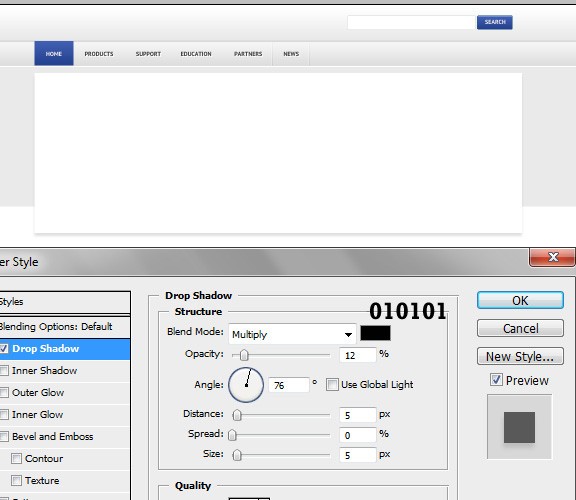
Now create a big, white rectangle and add some shadow with the details shown. A big stock image, a big headline and some text with another great button will be added.
Step 18
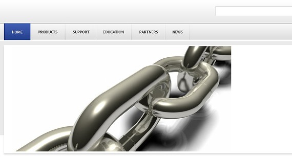
Add a any dummy image you want to that featured area. Be sure it covers more than 80% of the area. The one I chose is from a stock website.
Step 19
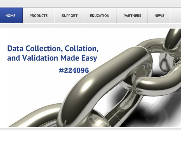
Add some text to it, use the PT SANS Bold font and make the font big.
Step 20
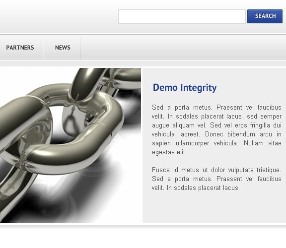
The remaining area should be filled with grey, in it we’ll place some text. This is really a secondary area which describes the image, the services, the company itself, or whatever you’d like.

Step 21
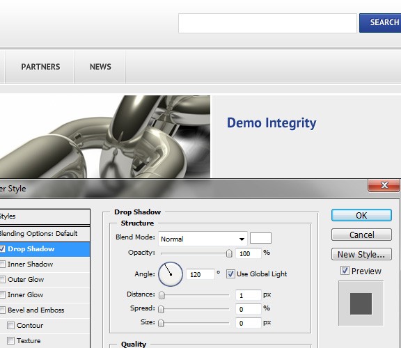
Place some blue-colored text which will be the title of the information below. Use the details in the image for Drop Shadow style.
Step 22
Add some dummy text. This could be some important information or whatever you’d like.
Step 23
Create another grey area under the featured zone, where we will add some text and icons later. Add the details as stated on the image. Mostly, the icons will promote the services offered by the company behind the website.
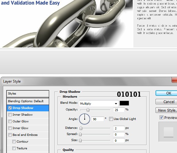
Step 24
Continue by adding a Gradient Overlay style for the last rectangle we have created in the anterior steps.
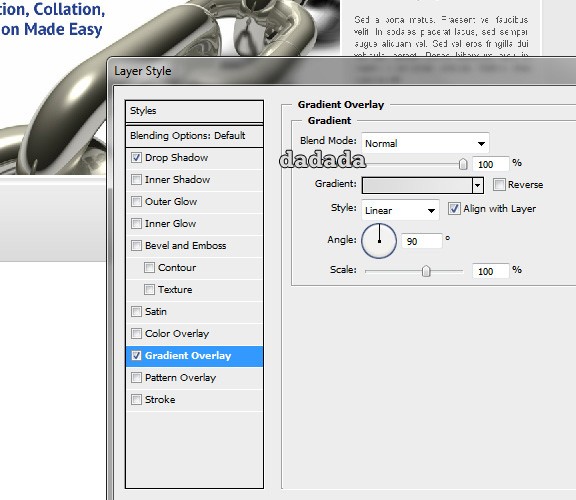
Step 25
Now we are adding titles and icons, as well as some divisions. The icons can be found in the resource list at the beginning of the tutorial. Be sure to choose your icons and text thoughtfully.
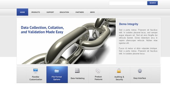
Step 26
At the border of both zones, create a small circle and fill it with dark brown color. Add some inner shadow as stated on the image.
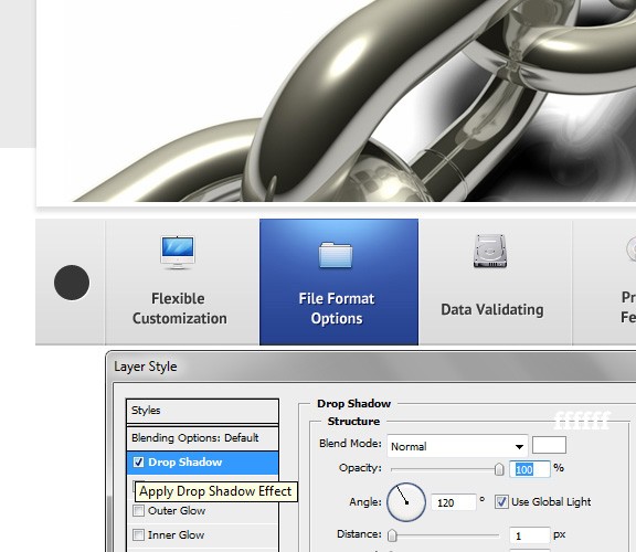
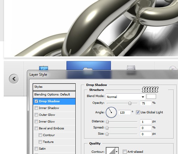
Step 27
Continue by adding a drop shadow layer style. It is another small detail, but it really makes that button zone minimalistic, nice-looking and well designed.
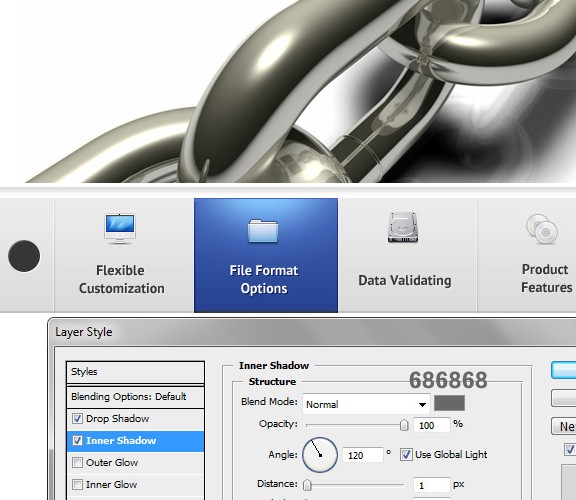
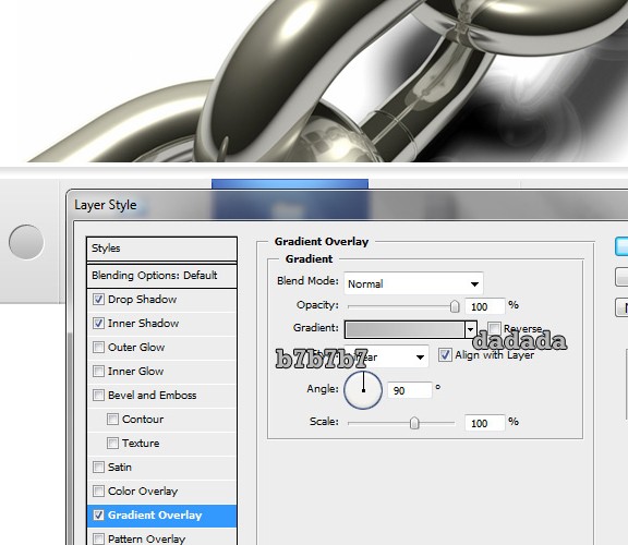
Step 28
To finish, add a Gradient Overlay effect.
Step 29
By using the Custom Shape Tool (U), create an arrow in both circles. Now add the details shown on the screenshot.
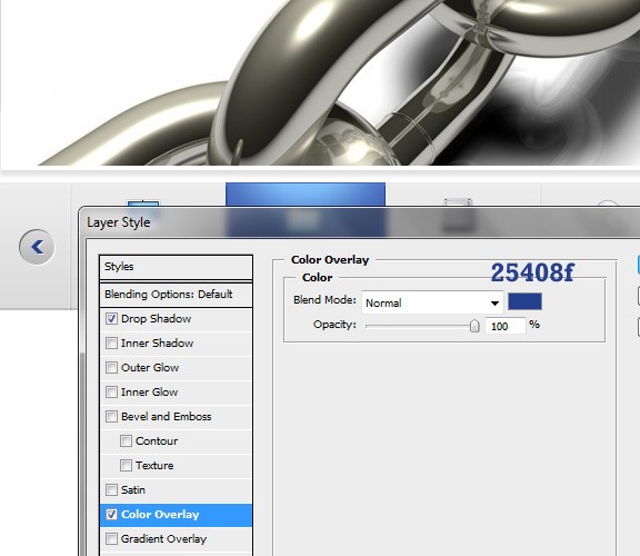
Step 30
Continue by adding some Color Overlay for the arrow. It should also be a blue color because otherwise, it will not fit the contrast and the colors used on the whole template.
Step 31
Add a video screenshot in the free space and place a title for it. For this template, I have used a simple screenshot of a YouTube widget.
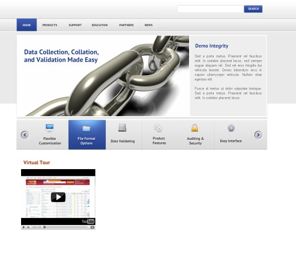
Step 32
Add the text “Product Highlights” and “Case Studies.” Let the text under the “Product Highlights” be links so you could showcase some friends’ websites or resources you admire/promote.

Step 33
Finish it by creating another form for e-mails, place all kind of other information, and whatever you’d like.
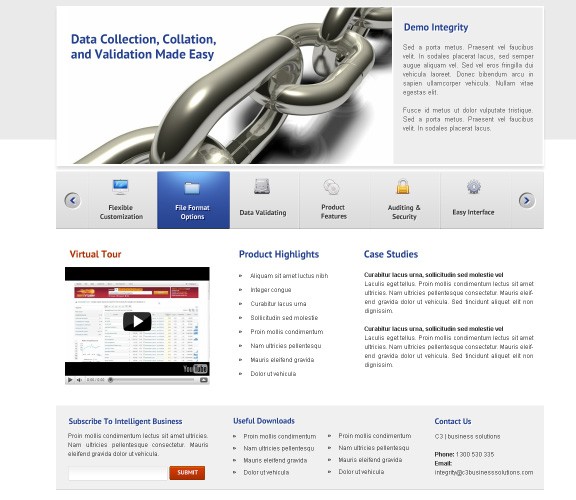
Step 34
Don’t forget to make a relevant/small footer for our template. If you have paid attention, you should know how to create the same effect as below.
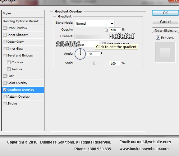
All done! If you have questions or suggestions, feel free to drop a comment. I hope you enjoyed this whole tutorial!
- Login om te reageren

