40 Super-Cool Infographics You Absolutely Have To See

 Infographics can be a great source for learning new facts and getting design inspiration. I even know several web designers who frequently make infographics to practice some skills. In this article we’ll be having a look at a great collection of these that you definitely should see! Here’s something for everyone.
Design can be complicated and design can be simple. By making infographics you can practice using your skills, setting up information in a new and creative way along with educating others in a fun way. There are lots and lots of these out there. This time we’ve decided to simply show you some of the better ones we could find, on any topic. Here are infographics related to design, social media, economy and all sorts of other topics.

Have a look at how the information has been set up. Sometimes these can look just like a mind map or brainstorming notes, while they other times are set up in a more specific way. A lot of the techniques use can translate well into both mind maps, web design and other creative areas.
We hope these can inspire and teach you a new thing or two.
Make sure to click the images to go see the full-sized ones. Several of these are very big and very detailed.
Enjoy!
1. The colors of the top 100 web brands
2. Yahoo developer network metro map
3. How Google works
4. The boom of social sites
5. The cmo’s guide to the social landscape
6. Do you need a new logo?
7. The 2010 social networking map
8. A modern history of human communication
9. How much do we really recycle?
10. Money in the food industry
11. Education by the numbers
12. Time wasted on loading unnecessary data
13. Green through the ages
14. Farmville vs. real farms
15. Facebook: facts you probably didn’t know
16. The most widely spoken languages
17. What BP could have bought with all the money they lost
18. Rock ‘n’ Roll metro map
19. Largest bankruptcies in history
20. What are people buying online?
21. The human tongue
22. Digital lifestyle
23. Serial killers
24. Twitter users profile
25. Animals & Humans: What’s the difference?
26. Healthcare costs by state
27. Labor day by the numbers
28. What makes good information design?
29. Nurses by the numbers
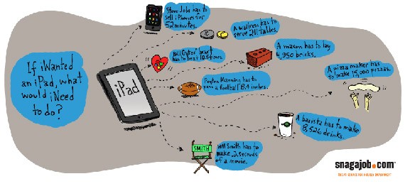
30. Can I afford an iPad?
31. A guide to buying your own island
32. The life of a cruise ship
33. What’s cheaper now than it was in 2000?
34. The bumpy rise of a start-up
35. The perfect pour
36. How do I win rock, paper, scissors every time?
37. Rubiks cube
38. Mythical creatures
39. The display ad tech landscape
40. Music preference by gender
Those were our picks of 40 really cool infograhics. We’d love to hear from you!
Which one did you like the best? – and can you see these translating into your area of design?
- Login om te reageren


