Using Flashy Product Photos to Improve Your E-Commerce Design

The main most important design aspect of any e-commerce website would be product photography. Being unable to touch, smell, taste and hold, alternatively handle the product they find interesting, the closest interaction the client could get are the images. Basically, the softer, tastier, flashier and more attractive your products look to shoppers, the more confident they’ll feel about purchasing from you and the better your conversion rate will be.
Knowing how deceivingly great product photos can look , keep in mind that your images should complement your website’s overall aesthetic and your company’s image. Let’s start with a few great examples of how online retailers have incorporated best quality product photos onto their websites and focus on images of actual items, rather than models, events or landscapes.
Great Examples of Flashy Product Photography
1. Mutant Shop
Very funky and uniquely crafted toys. Its clean product details and catchy colors invites the users to click on further and view their products.
2. Apple
Known and loved by gadget enthusiasts, Apple showcases their products that they can’t resist. With an additional limited number of images and a simple twistable 360-degree viewing mode, designers behind this website visually sum up Apple’s chant of fun and simplicity.
3. Better Closet
Provided with navigational options, users can search for their desired product easily. And with vivid detail of their products, they attract costumers even more.
4. Designbyhumans.com
One of the many known T-shirt companies. This one has a super-clean website and keeps the product well in focus, despite the human models (may sometimes distract from the product).
5. Soup Studios
This site sells very unique and one of a kind pottery, and ornaments. Their straightforward value proposition is strong and the content and labels chosen have shown customers why they should buy from them.
6. Bang & Olufsen
At first glimpse, it seems a bit less appealing, audio-video manufacturer Bang & Olufsen opts for a harder, more architectural aesthetic than some of the other websites we’ve looked at. While there is plenty of black, gray and white throughout, this website is far from cold and sterile, thanks to the side-sweeping product photos, which are bright but do not compromise the futuristic feel of the design. The pages of Bang & Olufsen’s collection have another nice touch: product thumbnails glow when you hover over them.
7. InCase
InCase offers not only neat and catchy product details, it also has the images of the product in different views. Thorough product details and reviews allows users to decide on their purchase more meticulously too.
8. Leica
From one of the world’s biggest names in photography and imaging technology, Leica has some high-quality images, especially of its camera equipment. You won’t find a ton of photos here, but in keeping with the brand’s no-frills, no-nonsense approach, the pictures you do see are high-res and sharp, a perfect example of how to do more with less.
9. Dog Funk
Touching up with a soft grunge style, this website sells snowboarding clothing and gear. Showcasing products with high quality images that would allure snow sport athletes and enthusiasts.
10. Chocomize
The ultimate playground for chocolate lovers. Provided with a wide variety to choose from, sweet-tooths can customize their own chocolate of their favored chocolate, fruits, nuts, herbs & spices, candy, decoration and other ingredients to satisfy those taste buds.
11. Accessories Online
This site is a good example of clear Call to Action at above the fold of the site. Which caters to a wide selection of categories for different user needs.
12. Ties ’n’ Cuffs
This is another e-commerce store with a huge selection of cufflinks, ties and other accessories. Just like CuffLinks.com, it offers a handful of photos for each product. But Ties ’n’ Cuffs gives a super-clear picture of product details, letting customers zoom in to the image, that one might miss in a wide shot and showing how the crystals reflect the light. Browse around this website to see how they’ve implemented their zoom function for many different products.
13. Toys R us
This site displays high quality photos of their products with vivid bright colors and detail. The site attracts customers from toddlers to moms and dads.
14. Abel & Cole
This homepage states very clearly why people should shop with them together with 4 reasons. This is their up-front value proposition and the core value that is well blended into the design and the organization.
15. CuffLinks.com
This site clearly invests on good photography on it’s cufflink products. It offers customers a good view of its cufflinks from all angles. It also shows the packaging or box that the cufflinks will ship in, giving us a well-rounded impression. Fortunately for this company, the size and inflexibility of cuff links make them a relatively easy product to photograph. Take a look at their many other products and the different angles the shots have been taken from.
16. Dune
Using a large high-quality photo on the background gets the customers’ attention. Displaying their designs in such a vivid manner, this site delivers their message upfront.
17. Archiduchesse
What’s great about this site, is that the user is just 2 clicks away from the ‘Check-Out’ button. This increases the functionality of the site, and easy purchase could also mean higher sales. Very smart and creative at the same time.
18. Victorinox
This brand is known for precision equipment. Victorinox has a remarkable range of visual content on its website, especially in the product area. The website has a high-profile on its great examples of selective focusing and dramatic lighting, which really make the products outstanding.
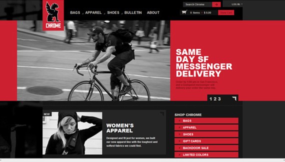
19. Chrome Bags Store
This site displays realistic photographs of people on the move, while using their product. Using awesome photography skills and carefully choosing the best shots to display.
20. Pong Cheese Shop
This site offers a convenient gift-giving service. You can put in a personal message in the checkout and they will hand write it onto a card for you. They display high-quality and clear images of their dairy products.
21. Harry Winston
This high-end jewelry line website, uses very vivid and close-up photographs of their pieces. Showing every great detail of their celebrity-chased collection of jewelry.
22. One Horse Shy
This site uses very clear shots of their tees and the prints on them. Giving customers an emphasis on what design would suit their interest.
23. Munich My Way
A clean and simple site, that gives focus on their products. Displaying very clear and consistent images, helps customers see the details and size of the footwear.
24. Made.com
Made.com does an excellent job of showcasing its products from multiple angles and perspectives without disorganizing the website or making the images feel redundant. The selective use of color throughout the website directs attention to the products themselves, while giving the overall design a sleek minimalist feel.
25.Fugitive Toys
This site showcases their products with vivid and colorful images that catches the customers attention. They also give the customers a clear view of their toys in various angles and gives full attention to details.
26. Itself
This site clearly states what their products are all about. This minimalist design gives a more focus on the product images which is good for the customers viewing.
27. Big Brown Box
The site showcases their appliances using alluring images that would invite shoppers to view more. They display high-quality and detailed photos of their products.
28. Trolley Cards
This site does an amazing job on showcasing their cards. Using great photography in various styles that allure the shoppers to buy their products.
29. Rapha
This site clearly invests on high-quality photography to sell their products online. They use photos that has subjects who actually are using the products rather than just using plain boring product photographs.
30. Pure and Little
This site showcases their products by showing cute, dramatic shots and good lighting. They clearly know how to pick effective photographs that will captivate the shoppers’ attention and click for more.
31. Tillymoss
The showcase of various designs and clear shots of details makes it easy for the customers to pick their favored choice. Using great lighting and best angle shots, the products are very eye-catching.
Conclusion
Give your customers the best quality images to help them decide and give them a clear view of the products you sell. It is important as well to provide user-friendly navigation and guidelines to assist the shoppers work their way to buying your goods.
- Login om te reageren


