Rounded: Create A Detailed Solid Dark Layout In Photoshop

Hello there everybody and welcome to another PSD web design tutorial here at 1stwebdesigner! In this tutorial you will learn how to create a Solid Dark Layout in Photoshop. A few techniques discussed in this tutorial include the use of proper spacing, typography, and colors. Let’s get started – I hope you will make out together with me until successful finish together !
Resources you will need to complete this tutorial:
Here is what we will making, click on image for full preview:
Step1: Working with Site Structure
Before we get started,download at first 960grid system for easy Guideline creation. Open 960_download\templates\photoshop\960_grid_12_col.psd . We also need to make sure that our Rulers and Guides are viewed, you can do that by pressing
- CTRL + R (View Rulers)
- CTRL + ; (View Guides)
Press CTRL + SHIFT + C to change the canvas size.
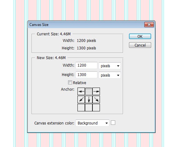
Using Paint Bucket Tool(G) fill the background layer to #242b30 Now you need to create a folders. Here is the folders that we will use in order to be organized. Implement this system in all of your designs – it will help a lot later when you will need to edit anything.
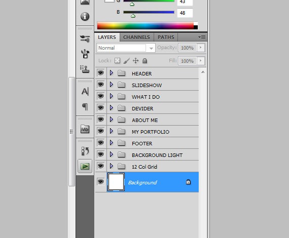
Now when you are done let’s get started.
Step2: Working with Header
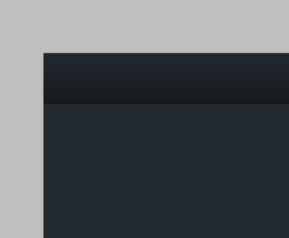
Rename the layer1 folder to Header and rename layer 1 to header_bg (Make sure that you have finished creating the folders as I said earlier). Create a new guideline go to View > New Guide and set the position to 100px, orientation to horizontal.
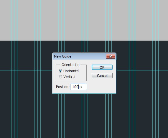
Select Rectangular Marquee Tool(M), make a selection as shown in the screenshot below and fill it with #ffffff

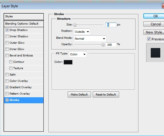
Add this Blending Option:
Drop Shadow

Gradient Overlay
- Linear Gradient
- Angle: 90
- #171c20
- #22292f
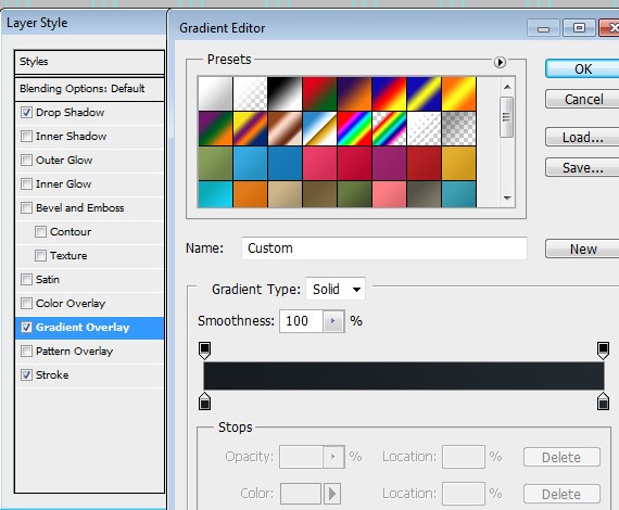
Stroke
- #0d1012
Step3: Working with Logo
Create a folder inside header folder and name it to Logo, put all your logo related layers there. Now we are going to add the Site Title/Logo, so select the Text Tool(T) and write text the same way as in the screenshot.
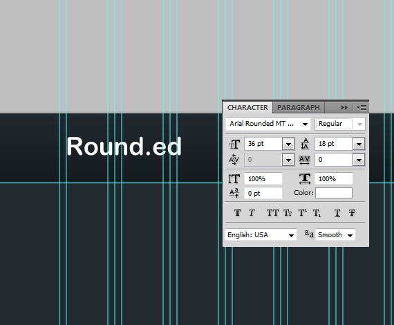
Add this Blending Option:
Drop Shadow
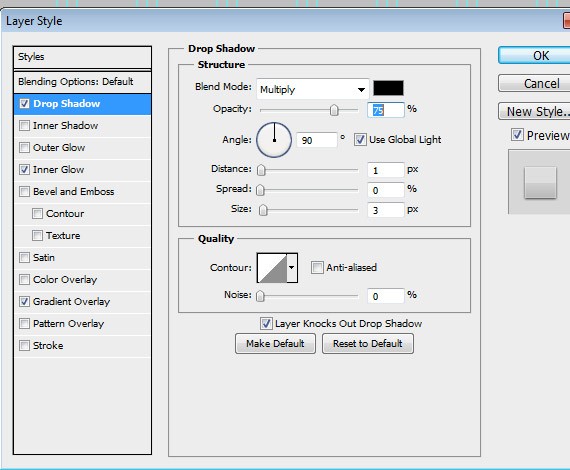
Inner Shadow
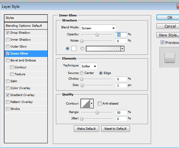
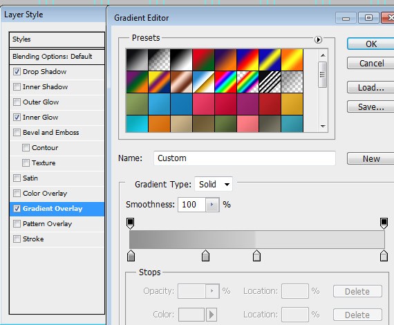
Gradient Overlay
- Linear Gradient
- Angle: 90
- #929292
- #bcbdbd Location: 30%
- #dfdfdf Location: 50%
- #dfdfdf Location: 100%
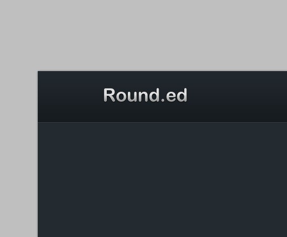
Now that we have finished styling the text, let’s create a light to make it more emphasized. Create a new layer below the text, name it to light and make a selection as shown in the screenshot below.
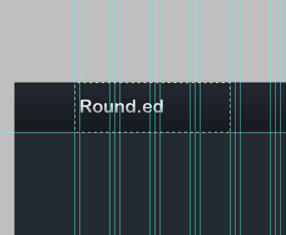
Set the foreground color to #ffffff Select the Brush Tool(B), right click to the workspace to show brush options.
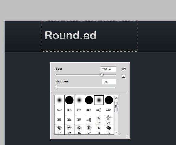
Brush as shown in the screenshot below to create nice radial effect to emphasize logo.
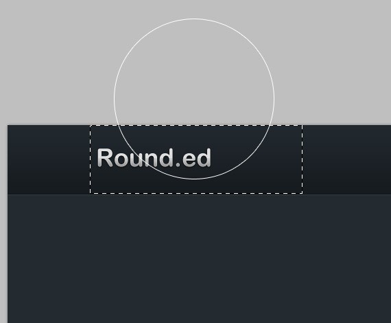
Set layer to Soft Light, Opacity to 80%:
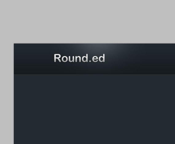
Now when we are finished with our logo let’s proceed creating the navigation.
Step4: Working with Navigation
Create a folder inside header folder and name it to Navigation, put all your navigation related layers there. Now we are going to add the Navigation Links, so select the Text Tool(T) and write text the same ways as in the screenshot.
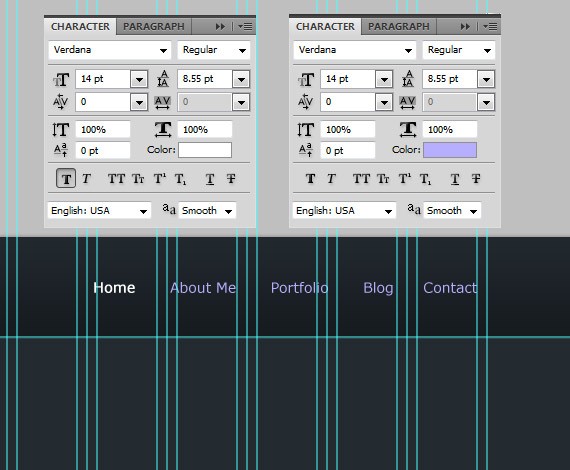
I separated the home link because it serves as Active state. For the other links I color it with #b6aefd.
Add this Blending Option for the home text:
Drop Shadow
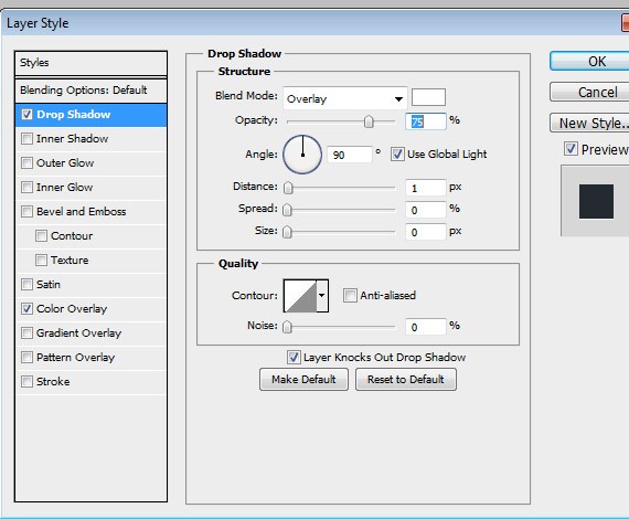
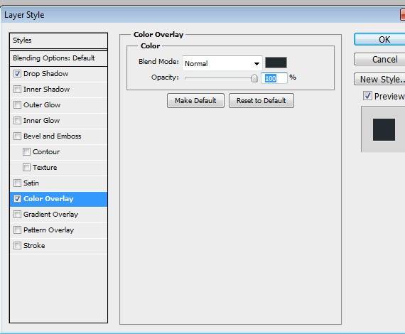
Color Overlay
- #232a2f
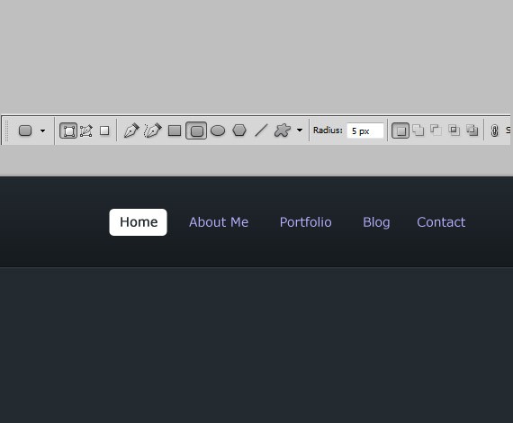
Now lets create the Active state styling for the home. Create a new layer below the home text, select Rounded Rectangle Tool(U) and set the radius to 5px.
Add this Blending Option:
Drop Shadow
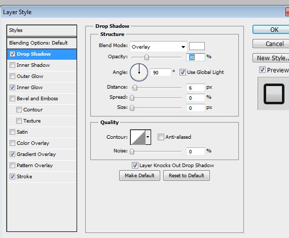
Inner Shadow
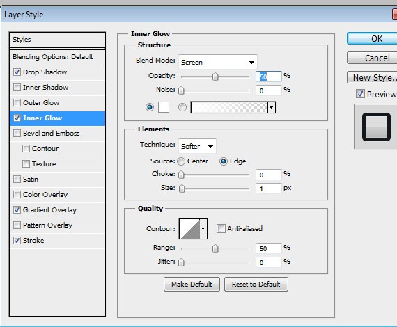
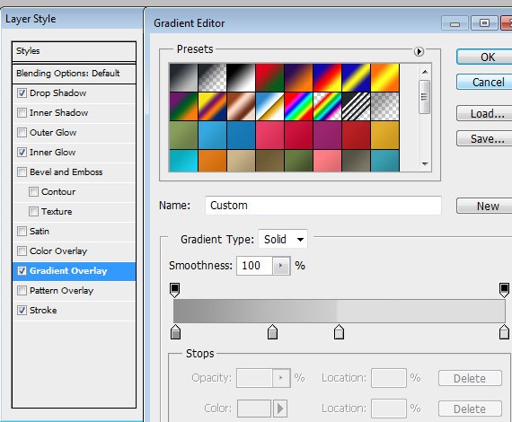
Gradient Overlay
Repeat the same step as we did to our logo.
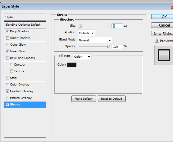
Stroke
- #13181b
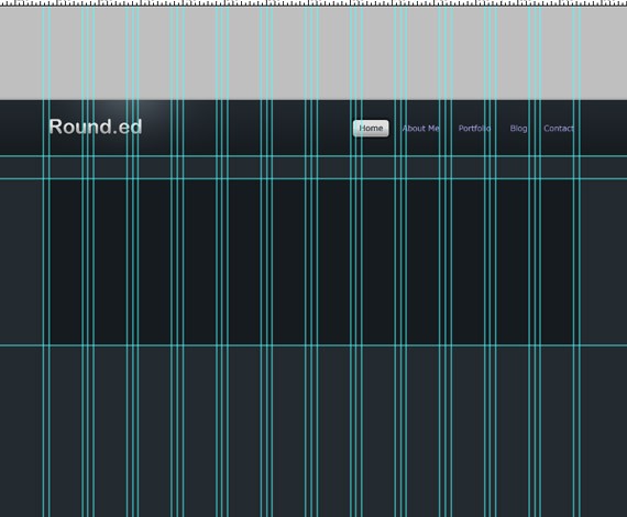
Step5: Working with Slideshow
Create new guideline go to View > New Guide and set the position to 140px, orientation to horizontal. Repeat the process and set the position to 440px.
Now we are going to add the holder of our slideshow. Set the shape color to #171c20, now select the Rounded Rectangle Tool(U), set the radius to 5px draw a shape the same way as in the screenshot.
Add this Blending Option:
Drop Shadow
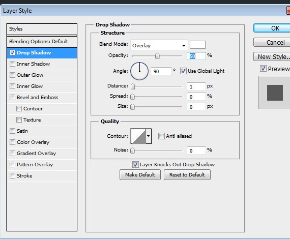
Now make a selection to the shape we have just create by pressing ctrl + click to the shape at the layers panel.
Go to Select > Modify > Contract, contract the layer by 5px. Now drag some guidelines to the edge of the selection left, right, top and bottom as shown in the screenshot.
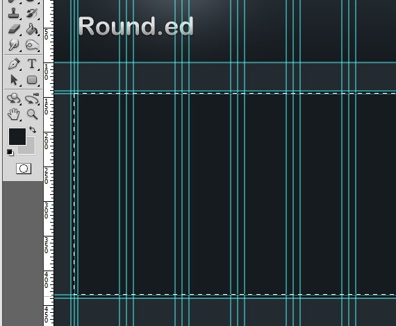
Select Rounded Rectangle Tool(U), set the radius to 5px. For the color I chose #36414a. Color of this shape will not matter because it will serve as the holder of the slideshow images.
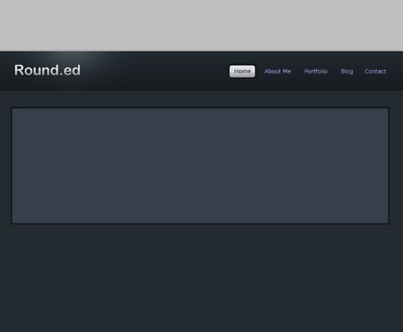
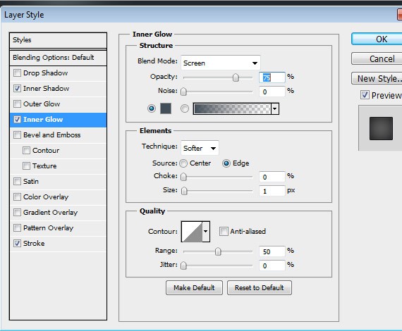
Add this Blending Option:
Inner Shadow
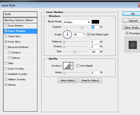
Inner Glow
- #424f5a
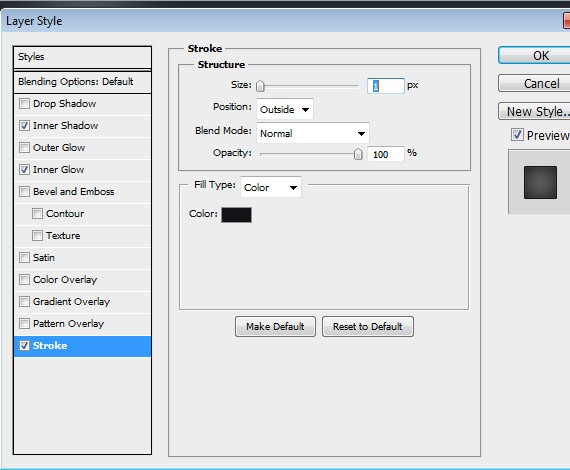
Stroke
- #111417
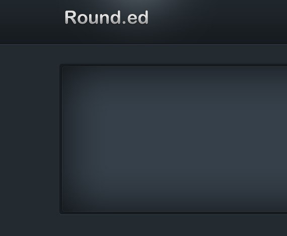
Create a folder inside slideshow folder and name it to divider. Make sure that this folder is on the top of the shape we have just created. To create a divider select Rectangular Marquee Tool(M), follow the color as shown in the screenshot.

We divided it into two parts, on the left part this will contain the description of the image in the slideshow, this will also contain previous and next button. The right part will contain the images. Lets start in the left part. Create another folder inside the slideshow folder and name it toleft.
Now select Rounded Rectangle Tool(U), set the radius to 5px, follow how I place the shape as shown in the screenshot.
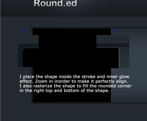
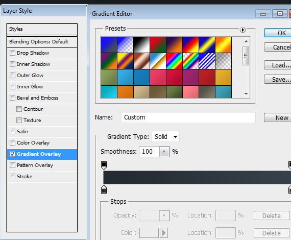
Add this Blending Option:
Gradient Overlay
- Stlye: Linear
- #242b31
- #36414a
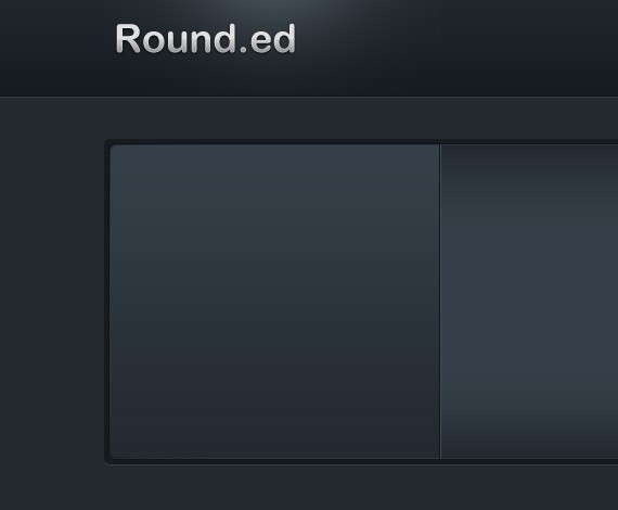
Create a new layer and name it header. Select Rounded rectangle tool with the same radius, follow how I place the shape as shown in the screenshot.
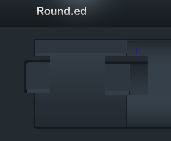
Add this Blending Option:
Inner Glow
- #424f5a
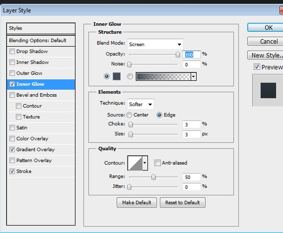
Gradient Overlay
- Stlye: Linear
- #21282d
- #2f3840
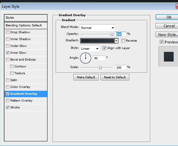
Stroke
- #111417

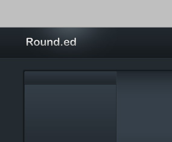
Now we are going to add the header text, so select the Text Tool(T) and write text the same ways as in the screenshot.
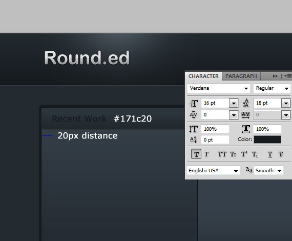
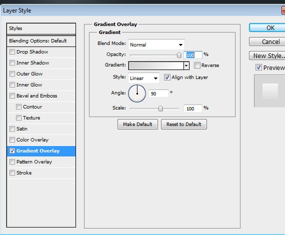
Duplicate the text layer. Now press down arrow key once.
Add this Blending Option:
Gradient Overlay
- Stlye: Linear
- #d4d4d4
- #ffffff
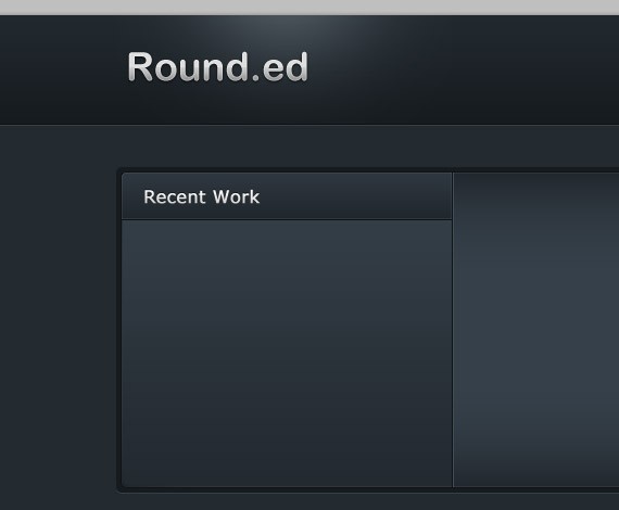
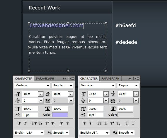
Now we are going to add the description text, so select the Text Tool(T) and write text the same ways as in the screenshot.
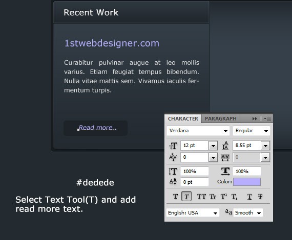
Now lets create a read more button. Create another folder inside slideshow folder and name it to readmore. Select Rounded Rectangle Tool(U), radius to 5px. Place the shape as shown in the screenshot.
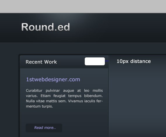
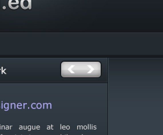
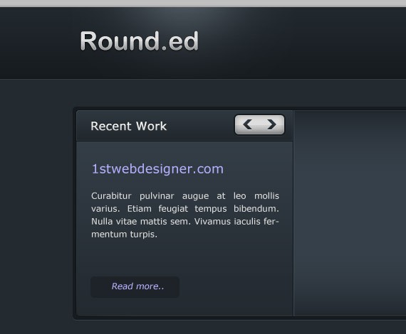
Now lets create a Previous and Next button. Create another folder inside slideshow folder and name it to prev_next. Select Rounded Rectangle Tool(U), radius to 5px. Place the shape as shown in the screenshot.
Add this Blending Option:
Drop Shadow

Inner Shadow
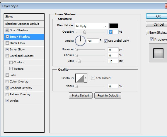
Inner Glow
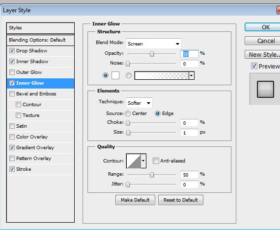
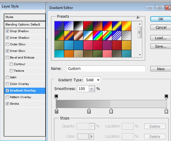
Gradient Overlay
- Linear Gradient
- Angle: 90
- #929292
- #bcbdbd Location: 30%
- #dfdfdf Location: 50%
- #dfdfdf Location: 100%
Stroke
- #161b1f

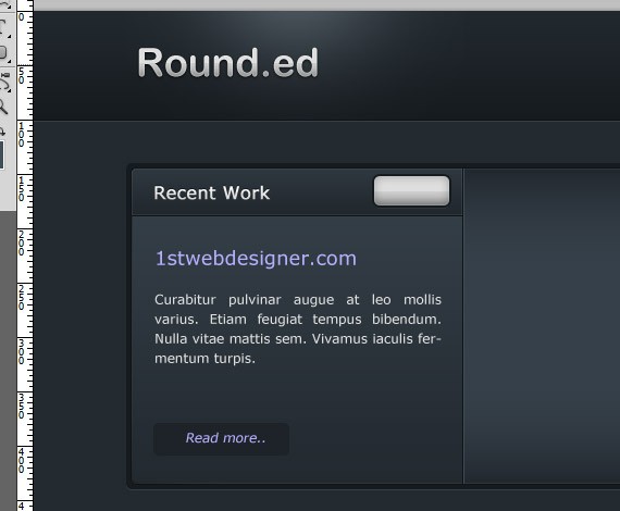
Now we will add the previous and next arrow. Select Custom Shape Tool(U), find the arrow as shown in the screenshot.
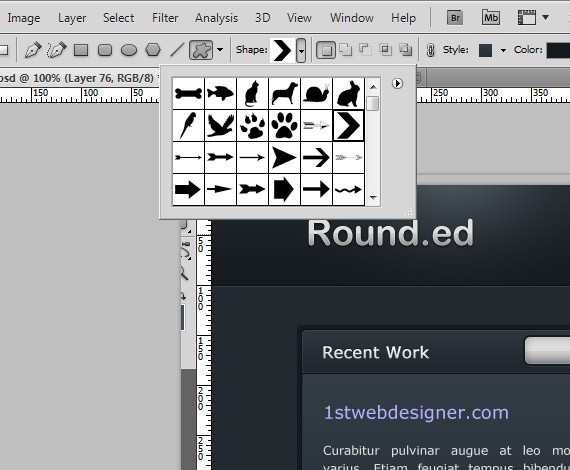
Place the arrow as shown in the screenshot.
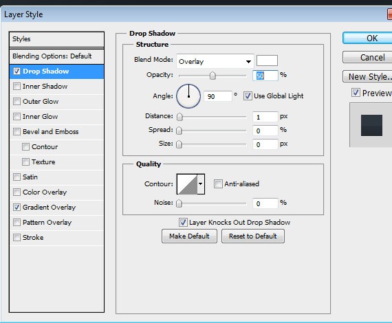
Add this Blending Option:
Drop Shadow
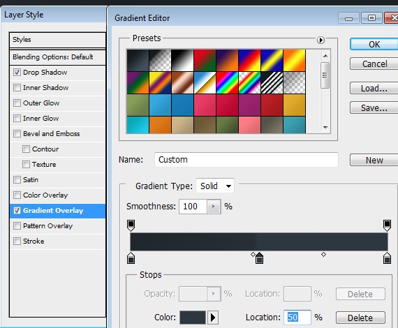
Gradient Overlay
- Linear Gradient
- Angle: 90
- #21282d
- #2f3840 50% and 100%
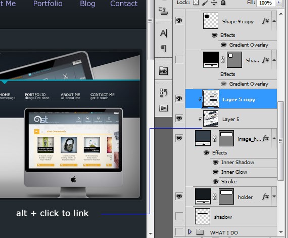
Now grab some of your works to put up in our slideshow image. From the layers panel create a new layer above the image_holder layer and link it together. Follow how I link it in the screenshot.
For the final step in our slideshow lets create a shadow to make it look like 3d. To do this select Pen Tool(T), follow how I make the shape in the screenshot and fill it with #000000.
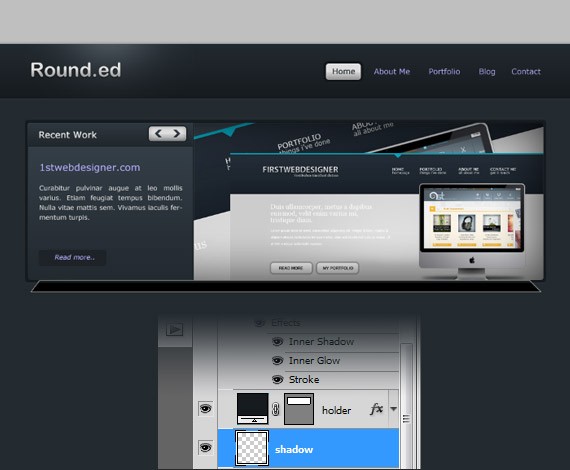
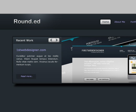
Select the layer and go to Filter > Blur > Gaussian Blur, set the radius to 5.0px. At the layer panel set the layer opacity to 80%.
Step6: Working with What I Do
Select the What I Do folder. Now we are going to add the What I Do Header, so select the Text Tool(T) and write text the same ways as in the screenshot.
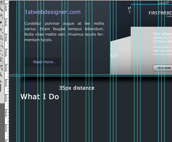
Add this Blending Option:
Drop Shadow
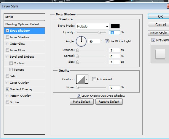
Gradient Overlay
- Stlye: Linear
- #d4d4d4
- #ffffff

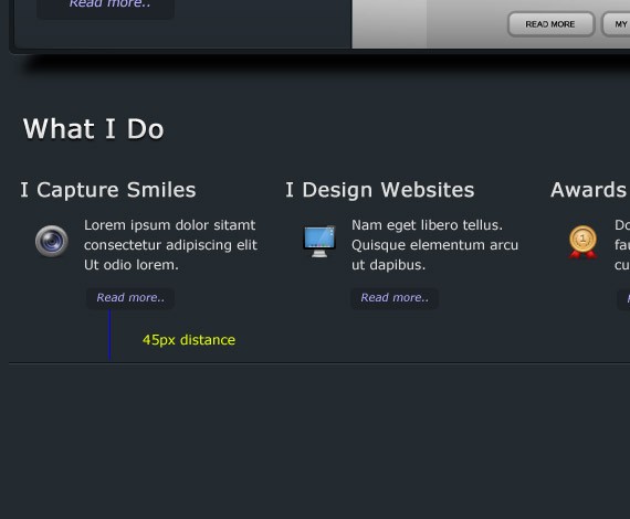
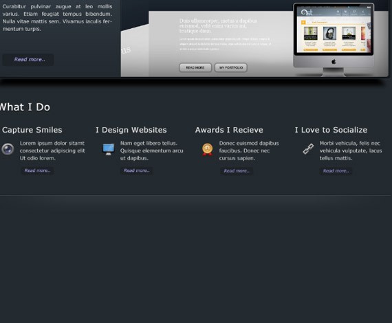
Ready the icons that you have downloaded. We will going to add 4 different folders in our What I Do folder. These are I Capture Smiles, I Design Websites, Awards I Receive and I love to Socialize, these will be on a separate folder.. Now follow how I place the text in the screenshot.
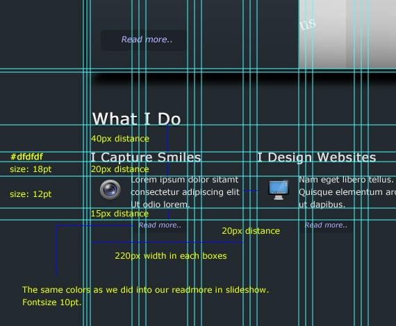
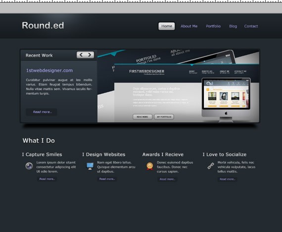
If you are done you may have something that looks like mine.
Step6: Working with Divider
Select the Divider folder, inside of it create a new folder name it lines. We are going to make 2 1px line to make a divider and some blending options to make it more interesting. To make the line we can do this by the use of Line Tool(U), For the 1st line color will be #111417 and 2nd line #364148.
Select Rectangle Tool(U), place it as shown in the screenshot and set the layer fill to 0%
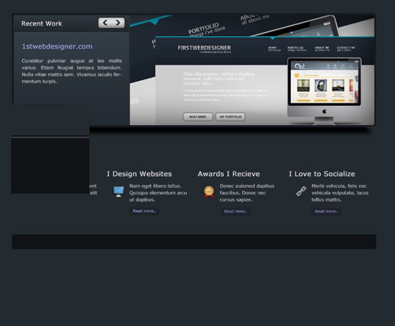
Add this Blending Option:
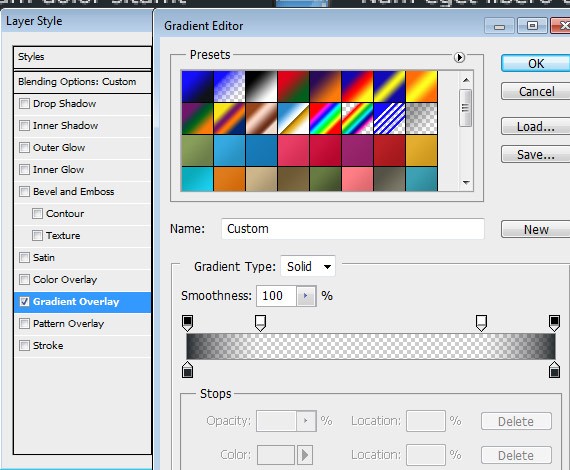
Gradient Overlay
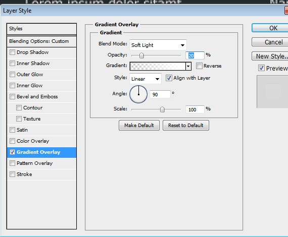
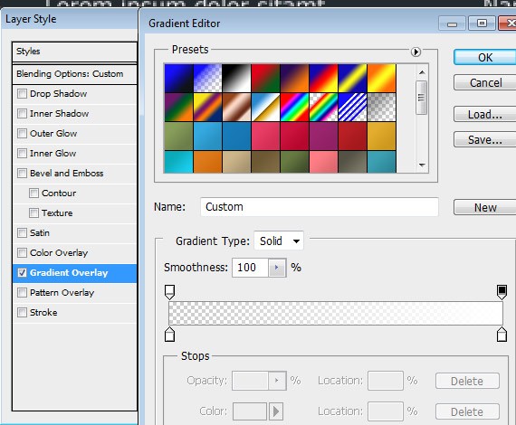
Duplicate the layer, were going to change the gradient overlay.
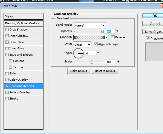
- #242b30
Step7: Working with About Me
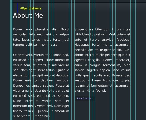
Select the About Me folder , now we are going to add the about me header and information, so select the Text Tool(T) and write text the same ways as in the screenshot. I use the same formatting in text as we id in our What I Do section.
Step8: Working with My Portfolio
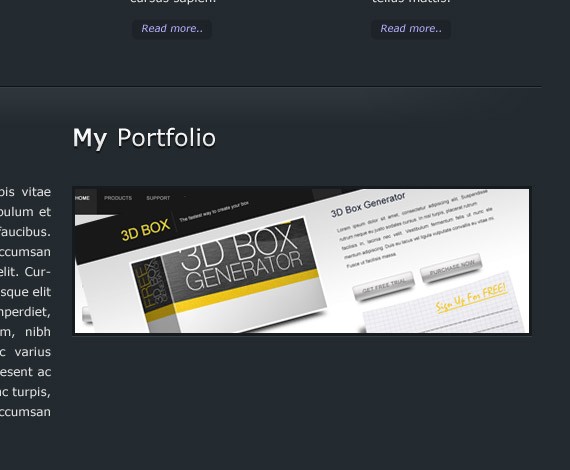
Select the My Portfolio folder, now we are going to add the about me header, so select the Text Tool(T) and write text the same ways as in the screenshot.
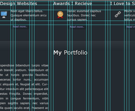
Select Rectangle Tool(U), and place the shape as shown in the screenshot.
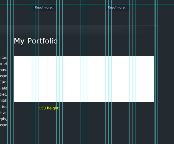
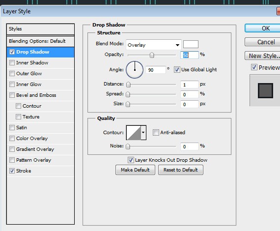
Add this Blending Option:
Drop Shadow
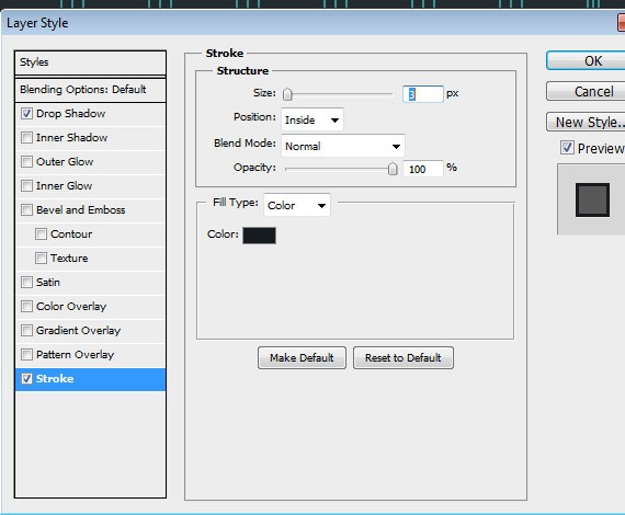
Stroke
- #161b1f
Now place your sample images at the top of this layer and link it together the same as we did in our slideshow.
Now we are going to add the my portfolio information, so select the Text Tool(T) and write text the same ways as in the screenshot. 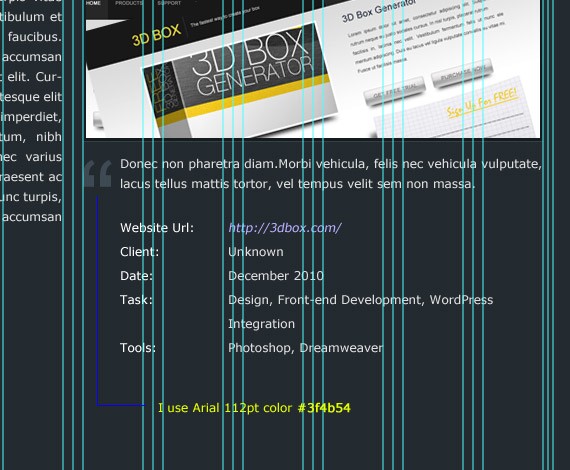
Step9: Working with Footer
Select the My Portfolio folder, now we are going to add the footer background, so select Rectangle Tool(U) and set the color to #171c20, place the shape the same way as in the screenshot.
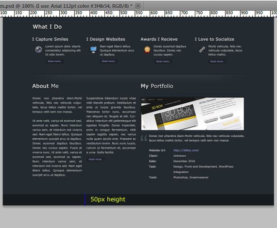
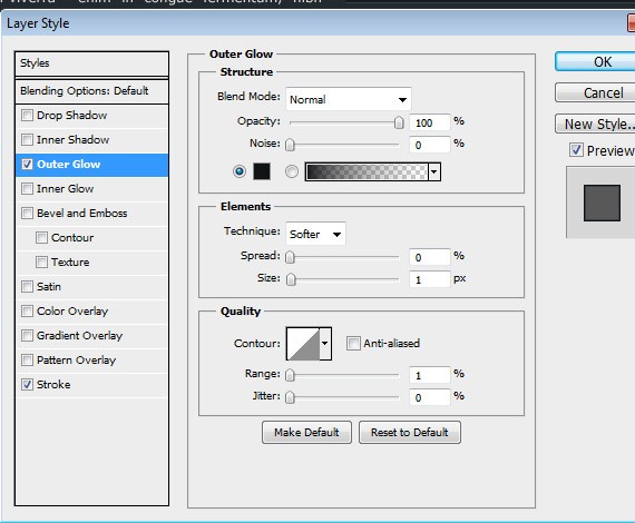
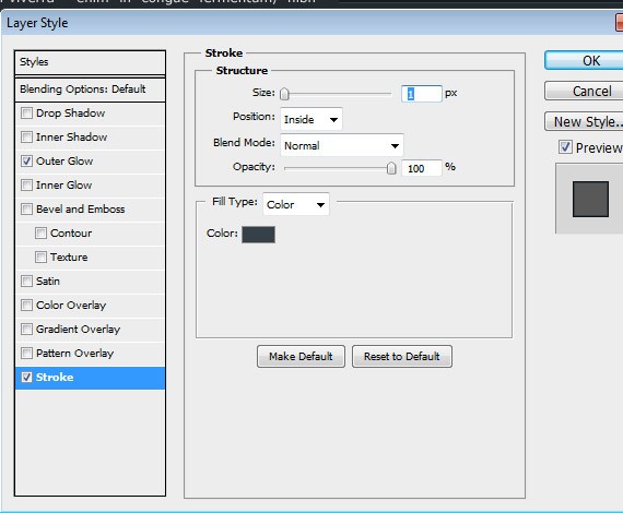
Add this Blending Option:
Outer Glow
- #111417
Stroke
- #364148
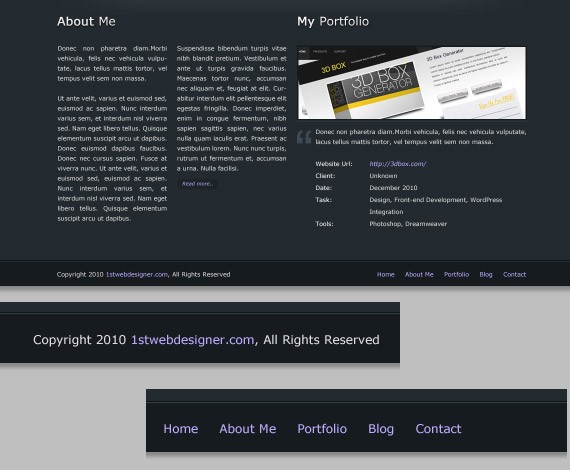
We are going to add copyright text in the left side and some links in the right side, so select Text Tool(T) and write text the same ways as in the screenshot.
Step9: Working with Background Light
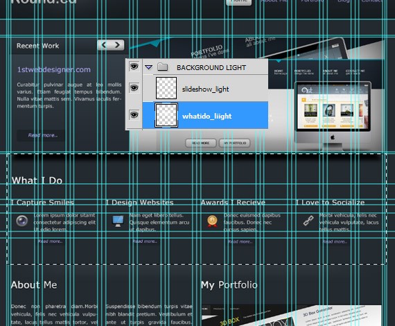
Notice that our background is just flat. In this step we will going to add more brightness in the slide show area and in the middle area. Now Select Background folder, create a 2 layers inside and name it Slideshow_light and the other is whatido_light. Select slideshow_light layer, select Rectangular Marquee Tool and make a selection as shown in the screenshot.
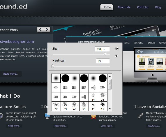
To create the light select Brush Tool(B) size 700 hardness 0%. Brush at the center top of the selection and at the layers panel set the blend mode to Soft Light Opacity to 70%.
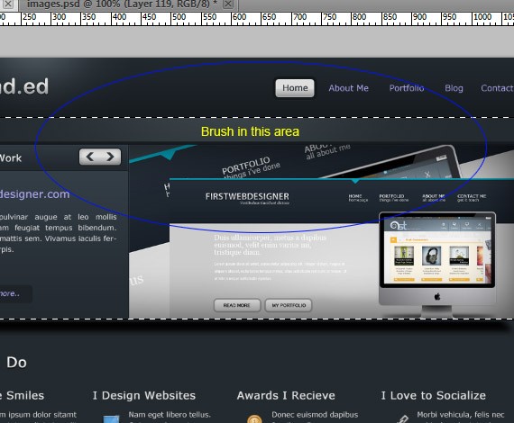
You should have lightning effect the same in the screen shot below.

Now select whatido_light layer. Select Rectangular Marquee Tool(M), make a selection the same on the screen shot below.
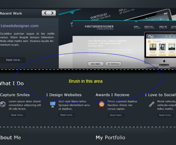
Now when you’re done set the layer blend mode to Soft Light and Opacity to 70% this will create a lightning effect that blends to our background shown in the screen shot below.
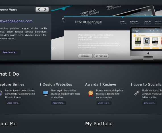
Finally were done! Hope you learn something on this tutorial and hope you like it. If your have any question or tutorial request drop some comments below. Thanks!
Final Preview
- Login om te reageren


