In-Depth Look into the WordPress Twenty Twelve Theme

Ever since 2010 WordPress has been releasing new themes to coincide with the new year. Previously the past two versions have been incredible and ultimately become staples in the WordPress themes gallery. And now we have the ability to install WordPress Twenty Twelve which is packaged with every new WP3.5 download.
In this article I’d like to go over some of the new features within Twenty Twelve. There are plenty of changes in comparison to last year’s theme, and lots of relatable functionality for web developers. This new design may also prove useful as a basic template for creating your own WordPress themes without starting from scratch. I am definitely a big fan of this year’s theme, and I am just as excited to see what the developers at WP will publish next.
New Core Features
Before jumping into the template I want to share that you may demo this theme from a live WordPress blog. You’ll notice right away that the whole layout has been revamped for a more minimalist approach. There is no header image in place anymore, and by default this feature is turned off. You will need to upload your own images and configure the settings in order to get headers working.
Also the theme contains a default homepage style which is more adapted for a CMS. WordPress initially launched as a blog platform but it has come a long way since then. Nowadays webmasters are constantly building WordPress sites which are geared towards CMS engines.
The theme is also using a new “Open Sans” font which is incredibly popular compared to other typical families. We have been using the same CSS font stacks for decades. It is nice to see the WordPress developers changing up styles in relation to modern trends. And you even have the ability to include your own custom fonts within the layout.
Dropped Sidebar
This was a big change for me when first checking out the theme. By default all Twenty Twelve installations will not display any sidebar content. It seems crazy but the WP developers have put together a unique sidebar template which only appears when there is content to display.
This means you can build a fully-widgetized sidebar which will not take up space in your pages. There is a custom “full-width” page template which completely ignores the sidebar even if you have content to fill. There are some pages where this just makes sense – and although you will generally want to include the sidebar, Twenty Twelve makes this process easier than ever before.
Responsive Design
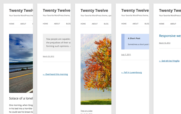
If you have demoed the layout on your smartphone it should become evident that Twenty Twelve was created with fully responsive design patterns. This means you can also resize your browser window and notice the same breakpoints in effect. The links and graphics have been designed to support all HiDPI and retina screens on any mobile device.
The top navigation menu even has a small jQuery toggle for displaying and hiding links. Users may really like this feature and choose to adopt a similar layout within new projects. All your custom post types and image media will also be fully responsive. This is great when you need to get a quick solution up and running without going back to edit all your posts and pages.
Unique Post Formats
Another interesting area is within WordPress post formats. You will notice these 5 different options in the sidebar of your WP Admin panel. The post formats include Aside, Image, Link, Quote, and Status. Each of these post formats is using a unique style as well.
I have not seen this effect being utilized quite enough by WordPress developers. The common templates you’ll notice often include these various post formats but do not use styles to differentiate between them. And much of the CSS is easily customized, so you may adapt the formats to suit your needs.
If you want to read a bit more check out the official WordPress theme article which goes over many of these features. You may calculate the pixels and finer details if necessary when constructing your own layout. I’ve been following the newer WordPress trends for a couple years and definitely like the direction where they are heading.
Closing Thoughts
In short the WP Twenty Twelve theme is definitely an improvement on the past 2 years. We can see powerful mobile-responsive tendencies along with a more widgetized design style. It appears the designers have really taken their efforts above and beyond for this new release! Be sure and grab a copy to test and demo in your own WP website. And let us know your thoughts on the 2012 theme here in the post discussion area.

- Login om te reageren


