Corporate Website Design: Creative and Beautiful Solutions

 |
What do corporate websites have in common with other people’s children? Three things: they have their charm, like finger-paintings on the refrigerator; they can be useful, if infrequently; they are usually admired only by the people who created them.
While designers know that a user’s experience on a website has a large impact on the way that customer will interact with them, impressing that concept on the corporate establishment has taken a very long time. Trends in design are making their way into corporate web, albeit slowly; with patience and a little luck, businesses will soon start to consider carefully coded and appropriately functional design as important as their mission statement and recent sustainability reports.
One unfortunate fact is evident above all else: despite having plenty of money at their disposal, many corporations are lost in sterile MS Word-esque designs that are more stagnant than a museum exhibit… though at least museums have dinosaurs and mummies and stuff. Here’s hoping we all will get new corporate clients soon.
Below, we present some interesting corporate websites, although the insight they offer may not be immediately apparent. This review is not about aesthetics or visual appeal, but rather about the design solutions the sites exhibit. In fact, corporate websites aren’t as visually arresting as you might think, so if the appeal isn’t immediately apparent in the previews below, take a moment to visit and interact with each of them.
[By the way, did you know we have a free Email Newsletter? Subscribe now and get fresh short tips and tricks in your inbox!]
Beautiful Corporate Websites
Levi Strauss & Co
With its website, Levis demonstrates that it has not only a strong flair for style and interactivity, but a rich sense of history. Hover over or click the photographs to see some of the company’s defining moments; ever known for its sense of identity, Levis draws you into its past, present and future, excellently breaking through to customers and inviting them to stay.
McDonald’s
By simplifying and softening the navigation, McDonald’s opens the entire screen up to use as canvas for their product. Harmonious colors in the typography complement the food (and exploit the visual association with hamburgers), while the vivid photography does not obscure surrounding elements.
Starbucks
Gentle colors and careful hierarchy of elements aside, Starbucks’ strength is in the details. The navigation exhibits an attention to hierarchy not often seen on corporate websites, while offering alternative destination links, should you find yourself in the wrong section. Such consideration for the user would be a welcome trend in design going into 2011.
Sony
You’ll see that this is a link to Sony Canada’s website. While the navigation and theme is the same as its American counterpart, the experience here is different: here you can see short films in which people relate their experiences of how Sony technology has enriched their lives. Best of all, a floating meter lets you sort stories into categories, giving you control of the content. Brilliantly executed.
The Ones You Would Expect
Adidas
Few websites employ a grid design that is at once so rigid and flexible. Individual modules expand and contract to allow for dynamic exploration—a lot of fun, particularly because the website has so many parts to explore. The only thing to note is that images do not obviously reflects the content they open to display, necessitating the standard top-menu — an important point in usability.
Citroen
While the technique of using tiny images to fill a shape has been done a million ways, Citroen takes an old technique to the next level. Draw your cursor across the world to see the photos dance around it, beckoning you to select a region. An excellent use of a landing page, effectively drawing in users without information inundation.
Fender Guitars
While you may need to be a guitar player to fully appreciate the beautiful lines and tones of Fender products, you need only a pair of eyes to appreciate the simplicity and functionality of Fender’s website. Unobtrusive navigation at the top and hot links lower down make way for a large stage on which Fender can showcase the stars of its website: its beautiful instruments.
Heinz
One of the most recognizable brands in the world, Heinz has intelligently focused its website on its consumers. Rotate the globe by clicking on photos to see simple recipes from around the world. A design brilliantly suited to users of any skill level, Heinz has found a new means to engage their customers and entice them to visit more.
Prologue Films
Any company that designs opening credits and effects for movies needs a keen aesthetic sense, and Prologue Films’ visual dynamic is evident on its website. A clean grid with gray tones puts the company’s custom type and effects (an impressive collection) front and center, the same technique made famous by artists and photographers. Using a pop-up window for the content, though, is ill-advised.
Rolex
The beauty of this website is in Rolex’ masterful attention to detail. With the gorgeous products on display, the eye almost misses the clever tricks contained therein, such as the clock face that adjusts to your time zone. The intuitive user experience reinforces the notion that great design blends together. When it works right, it’s seamless.
Steinway & Sons
Lucky for us, Steinway invests as much effort into its website as it does into its pianos. Elegant type and warm subtle imagery grace this design and project an image of quality, undoubtedly the intended effect.
The Ones You Should Have Thought Of
Aflac
While a blue and white palette is nothing new, Aflac has mastered the use of subtle gradients to enhance type. Smartly assembled, this site is intuitive and easily digestible. The clever part is the horizontal scrolling frame, a visual hook aptly used here to display customer testimonials.
American Standard
A gorgeous website; American Standard exemplifies grid design, employing the majority of frame as a news scroller. Intelligent use of color, elegant type and thoughtful spacing make this website particularly easy on the eyes.
Avery Dennison
At first glance, this might look like the website of any old manufacturer of office supplies. At second glance, though, brilliant little touches leap out:: the subtle grid, the attention to readability, the side-scrolling frame that harmonizes type, color and imagery. Oddly dissonant, the side and top navigations make this website looks almost as if it were a composite of different designs over time, a curiosity.
Con Edison
While the Con Edison website doesn’t have much to look at, the section for the annual report has been capably executed. Great attention to space, clean type and subtle movement are all used to great effect in this section where Con Edison addresses its corporate responsibility.
Grow Interactive
Most interactive firms don’t have exciting websites, which makes Grow stand out all the more. Grow demonstrates an expert use of type and illustration, moving your eye in perfect circles over the page, and nuances like the small interactive animals along the footer make it stand out among its peers.
PGI (formerly Premiere Global)
Here is another rare instance of a Canadian version surpassing its regional siblings. A playful take on the boxed blog/corporate theme, the website for PGI puts an interactive panel into the fold, an attractive way to draw users further into the website. The layout and color elements are evidence of authentic design acumen.
Rohm and Haas
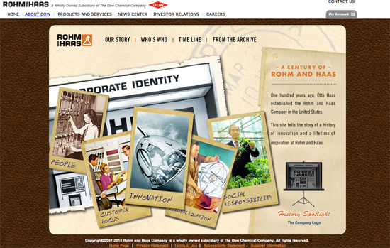
This Fortune 500 company knows how to engage visitors online, with interactive features coming from every angle. The innovation in its products is reflected in the playfulness of the website, which encourages users to explore. Careful, effective use of otherwise familiar textures and themes support an engaging concept, to good effect.
Society for Environmental Graphic Design
While the inclusion of an organization of graphic designers in this showcase is no surprise, SEGD shines in its presentation of simple yet powerful elements. As any designer can attest, bold colorful shapes can easily run a design off course, but that isn’t the case here. SEGD has married vivid color with effective usability, creating a website that is smooth and wonderfully user-friendly.
Virb
Recently rebranded and redesigned, Virb demonstrates a capable grasp of visual elements even in this placeholder page: good typography, ample white space, soft shapes and forms — akin more to social media than standard corporate toadery, excellently indicative of the target demographic.
The Ones You Might Not Know About
Acro Media
A Web development firm that knows exactly when to stick to the grid and when to break boundaries. The most impressive parts of this website are the way certain elements react to hovering, such as the company name in yellow at the top left. Mousing over it flips the logo around to display a toll-free number. Clever.
AgencyNet Interactive
The spirit of AgencyNet is clearly the team of creatives behind its work. Showing the team at work (and play) behind the scenes in the office is refreshing, well executed and a great way to engage viewers to learn about the company.
AmoebaCorp
A small creative firm, AmoebaCorp shows expert use of type on its website. The type establishes a strong hierarchy, enabling the content and navigation to coexist on the left without confusing the user about functionality.
Imaginary Forces
Less is more with Imaginary Forces, which displays its brilliant work as prominently as possible by cluttering the screen as little as possible. Even without the showcased work, the website would stand out: take away the grand images, and you’d still have a clever arrangement of type and navigation, which is more than can be said of most websites.
Kurylowicz & Associates
This Polish architecture firm has produced a website that bleeds inspiration from every pixel. Elegant in its use of gray tones, this website combines line, shape and space in a way no other website does. Perhaps it took an engineer to think abstractly enough to design with such abandon, but the result is brilliance online, from start to finish.
Vancouver Convention Centre
Aside from the harmonious colors and subtle grid that frames the content, the Vancouver Convention Centre succeeds by going the extra mile to make its website visitors feel local: the “Cheers!” factor in action. Not many websites impart a sense of belonging with their welcome; that this one does makes a strong case for using heart as a design tool as much as shape, color and texture.
What Have We Learned Today, Bobby?
Finding beautiful corporate websites proved to be quite a challenge, and we had to make a number of unusual choices along the way. We sought regional versions of international websites, for instance, because multi-national companies present a number of differences among their sister websites. Bizarrely, did you know that many Fortune 500 companies don’t even have websites? Or worse, have non-working ones?
Admittedly, the word “corporate” is pretty loose in definition here. For the sake of impartiality, we did not discriminate by industry or field. We were more interested in collecting websites that employ interesting techniques. Because innovative and fresh stand out on the Web whatever the industry, putting aside traditional definitions is crucial.
For further reading on corporate websites and design, you may be interested in Corporate Blog Design: Trends and Examples, published August 2009.
Would you like to see more similar showcases on SM?
Would you like to see more similar showcases on Smashing Magazine?online survey
(al)
© Bobby Foley for Smashing Magazine, 2010. | Permalink | Post a comment | Add to del.icio.us | Digg this | Stumble on StumbleUpon! | Tweet it! | Submit to Reddit | Forum Smashing Magazine
Post tags: showcases

- Login om te reageren


